Sunday, July 6, 2014

FINAL Submission

So here is the video outcome of my animation but first, I want to thank my tutor, Mr Angus Lee for teaching us Rhinoceros, 3DMax and even Adobe After Effects for this past 14 weeks. I could not have done this and even my Architecture Studio Projects without his guidance. Next, I want to thank my friends who helped and gave me ideas while I am doing my computer applications projects throughout this semester. Also, my sister, Soh Rou Yen who allowed me to use her song as the background music for my animation.

This is my final animation for Project 3, Pantai Kerachut Retreat. Enjoy ^^

Week 14

So I used the same method that I showed in the previous WIP to create the pathways for every interior rooms. Then I started to test render my work. At first, I tried HDTV as the output size of the animation. The quality looks quite good but it can only be played by VLC media player.  I wanted my video to be played in Windows Media Player as I m using Windows Movie Maker to compile all my works. So I tried every video output size in 3D Max but in the end only NTSC DV can be played in Windows Media Player.

Because of time constraints, I can only render my animation in its lowest quaility. I even disabled the final gathering point so that it will be faster. If not it will take 35 hours to render a 20 sec animation. In a nutshell, I spent 48 hours to render the entire animation.


After rendering all the parts of the animation, I decided to use Windows Movie Maker to compile and edit my animation. Below are some screenshots of how I insert and edit my animations.

After importing and editing the animations, the final step was inserting a nice song that suits the animation. I chose a song that my sister composed, named Questions for my animation as it is a relaxing song and I feel that it gives a very pleasuring kind of feeling to the viewers. So this is how I finish my animation for this final project.

Wednesday, July 2, 2014

Week 12 & Week 13

For our final project, we are required to create a 90 sec animation video. Firstly, I planned out the plot of my animation. Basically, I divided my animation into 5 parts. The first part will show the exterior of the building and zooming in into the building. Then it will be the second part showing the living hall. The third part will show the dining hall. The forth part will be showing the bedroom and the last part will be zooming out to the exterior again and it ends. 

So I started it out by creating a line as the pathway for the camera. Then, I selected the points at the line and right clicked "smooth" and it became a smooth curve. 

Then, I selected the points at the line and right clicked "smooth" and it became a smooth curve.

Here is a picture of how it looks like after I clicked "smooth".

Later on, I adjusted the height of each points so that my camera will flow smoothly from up to down.

When I am done with that, I created a Target Camera. Then, I chose Motion > Position: Position XYZ > Path Constraint and clicked the curve that I created previously. Thus the camera flow smoothly with the pathway. Basically this is how I did for the first part of the video.

Thursday, June 12, 2014

Week 11 & Submission

When I confirm the camera views that I wanted, I started to test render the view. Apparently, I encounter a huge problem which is the 2 windows ( indicated by the red dots in the photo below) could not show the background behind the glass. I tried a few times but it was still the same. 


So I decided to try on another angle to see whether it happens to the same on it. Also, the windows are still the same and the perspective on my contour changes from what I seen from my perspective viewport.


Thus I tried changing the materials of my window's glass but it was still the same. I deleted my glass and imported it again from Rhinoceros and still, I could not solve the problem. It was very tough for me. Below is a picture of how it looks like without the window glass. I have friends who suggested me to take off the glass and let it be but I wanted the glass so that you can see the reflection of the lights on the windows to make it realistic.

In the end, I tried on changing the picture on the environment. I changed it to another picture which a night time sky picture. Everything is just perfect after I change the "Environment". I realised maybe the picture I used before causes the perspective to go wrong and made my glass couldn't show the things behind. So here is a picture of how it looks like after I changed the background in Environment.


Moving on, after I rendered my master bedroom, I found out that the intensity of the light was too high which causes it glowing brightly. In order to fix this, I lower down the intensity of the light and everything became normal and it looks much better. Below is a picture of it of high  intensity of light.


This is the one after I changed the intensity of the light.


Same goes to the dining hall and kitchen, I encountered the same problem of the glass but after I changed the background image at Environment, everything became fine.

Lastly, after I was done with all the renderings, I edited the colour of the photos a little bit using Photoscape. Besides, I used Adobe Photoshop to touch up some little things, like the lighting etc. Below are the 3 photos I am submitting for my Project 2B.

Living Hall

Master Bedroom

Dining Hall & Kitchen

Friday, June 6, 2014

Week 10

Continuing from what I did last week, I decided to finish off placing all my furniture into the building so that I can focus on the interior lighting and camera angle at the end. Below is a picture of the cabinet in the kitchen.

After placing all the furniture, I only started placing the lighting into the building. First and fore most, I started by placing a light in the lamp. I chose Free Light and put in on the bulb in the lamp. Also, I changed the colour of the light to a more warm colour instead so that it looks more realistic. Here is a picture before I change the colour of the light. As you can see, the light reflected on the floor is white.

Here is a picture of how it looks like after I changed the lighting colour to warm yellow colour. It enhances the quality of the space. Also, I changed the intensity of the light so that it is bright enough is brighten the area.

Moving on, I continue the interior lighting on the ceiling. I started off by choosing Free Light and I changed the intensity of it and changed the Shape/Area Shadows from "point" to "disc". Then, I copied and pasted it on the position I wanted.

After having all the light on the correct spot, I made a Cylinder as the Downlight. Same as the lighting, I rotated it, copied and pasted it on the position of where the light is.

Besides that, the lighting I did for this Dining Room's luster is also quite simple. I copied the light that I used for the Downlight and pasted it inside the light bulb. As there is a cylinder form covering it, I changed the shape of the light into cylinder so that the lighting will be in a cylinder shape. Below is a screenshot of how it looks like originally.

Here is a screenshot of it after I changed it to cylinder. It can only be seen after I render it.

Since the luster is hanging on the ceiling thus there should be lights reflected on the table and also the floor. To actually make that happen, I used a target light to show that. The point of the target light is from the light bulb on the luster. Here is a picture of how it looks like.

Then, as I wanted there to be lighting under the bed so that the bedroom look more classy, I added lighting and changed the shape to line so that there is a horizontal lighting underneath the bed. The effect can only be seen after I render it.


Finally, after all the furniture and lightings are confirmed, I started exploring some camera angles to get a nice view of the whole space. Also, I realised we should target camera to capture the angle that I wanted.

I moved the camera to the position I wanted with the help of plan view, right view and front view. Also, I played around with the thickness of the lens.

Friday, May 30, 2014

Week 9

For Project 2B, we are required to finish the rendering for interior of our building. Thus I started off by adding furnitures and finishes for the interior of my building. I downloaded the furnitures from Archive 3D. Below is a picture of the sofa.

Here are the process of me adding some furnitures into the living room.


After I added the furniture, I applied the materials on the furniture. I spent quite some times to try different kind of colours on the furniture to get the appropriate one.


Besides, I even used a drawing of mine to make it as a picture to frame it on my master bedroom. Here is the drawing of a zebra I did previously. I scanned it and put it as the picture using the Material Editor.

Moving on, I used Target Camera to get the correct angle that I want to capture. I applied the method that I have learned in lecture class to get a nice angle of it.


I tried out different angles but at the end I decided to get with this one as it best showcase the living space. After this, I will be applying interior lighting into the space so that the interior will be brighter.

Friday, May 16, 2014

Week 8 & Submission

For this week, I started off by adding a door handle to my door to make my building more detailed. I download the file from Archive3D and I imported and merged to my file. Below is a picture of how it looks like when I import the file.


This is how it looks like after I scaled and rendered it.


After I finished everything, I made all my trees under one layer and I turn it off so that it won't make my whole file lag. Later on, I clicked Environment Render to change my background. I got a photo of a sunset view as I feel that my building will be best presented during the evening time. Thus, I used the method from I learned during lecture time to change the background. Also, I changed the figure for Exposure value to 12 as the daylighting is the best compare to others.


Moving on, I set the camera view to get a nice angle of the building. I tried different kind of angles to pick the best ones. I did not choose a bird eye view as I know I will have some trouble adding the trees in scrubs using Photoshop. So below is one of the angles I chose as one of my picture.


Next, I saved my file into PNG and opened it in Adobe Photoshop so that I can make some colour changes and adding scrubs into my picture. Below is a photo of I add in the scrubs.

After adding trees and scrubs, I edit the colour of the background to make it more contrast so that my building will stand out more. Also, I added some sunlight to make my picture more realistic. In a nutshell, below are the 2 photos that I am submitting for Project 2A.
Scene 1 (Eye level view)

Scene 2 (Eye level view)


Scene 3 (Worm's eye view)


Friday, May 9, 2014

Week 7

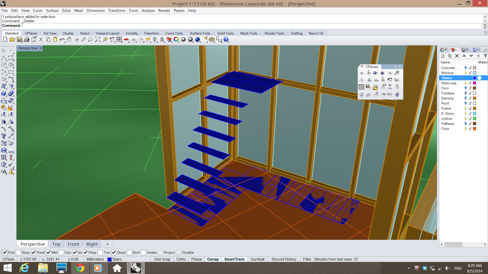
After the submission last week, I proceeded my progress by finishing off the interior of my building. I did the staircase by extruding the lines I drew before. It took me quite some time to finish everything as I need to extrude it stairs by stairs.

Here is a picture of how it looks like after deleted the extruding walls.

A picture of how it looks like at the end.

Moving on, I imported my file into 3D max so that I can start rendering the exterior and finish off the site context. First of all, I coloured my contour brown as the site is mostly covered with grass and soil.

After I was done with that, I started doing the grass by choosing "Hair and Fur" under "Modifier List" and I did some adjustment at the figure so that the size and height of the grass looks appropriate. Below is a picture of the grass before I edit the height and the colour.

Here is a picture after I made some adjustment.

A closer view.


Next, I started to insert the materials on the facade of the building. Like timber frame, concrete wall, etc.

A picture of it looks like at the end.

After I m done with the materials, I started to insert trees. I downloaded some trees from Archieve 3D as the one provided in 3D Max does not suit my site. So I merged the file downloaded into my file. Then I scaled it.

Here is a picture of how it looks like after I scaled it into a bigger size.

Later, I rendered my trees with some colours so that it looks more realistic and I am quite happy with the outcome of the tree.

Here is an overview picture of the trees and my building on site. I will be continuing to add more trees and later on I will be adding the Daylight and sky for my last part of this project.